Brewing a Fresh Brand Identity Design for Daily Grind
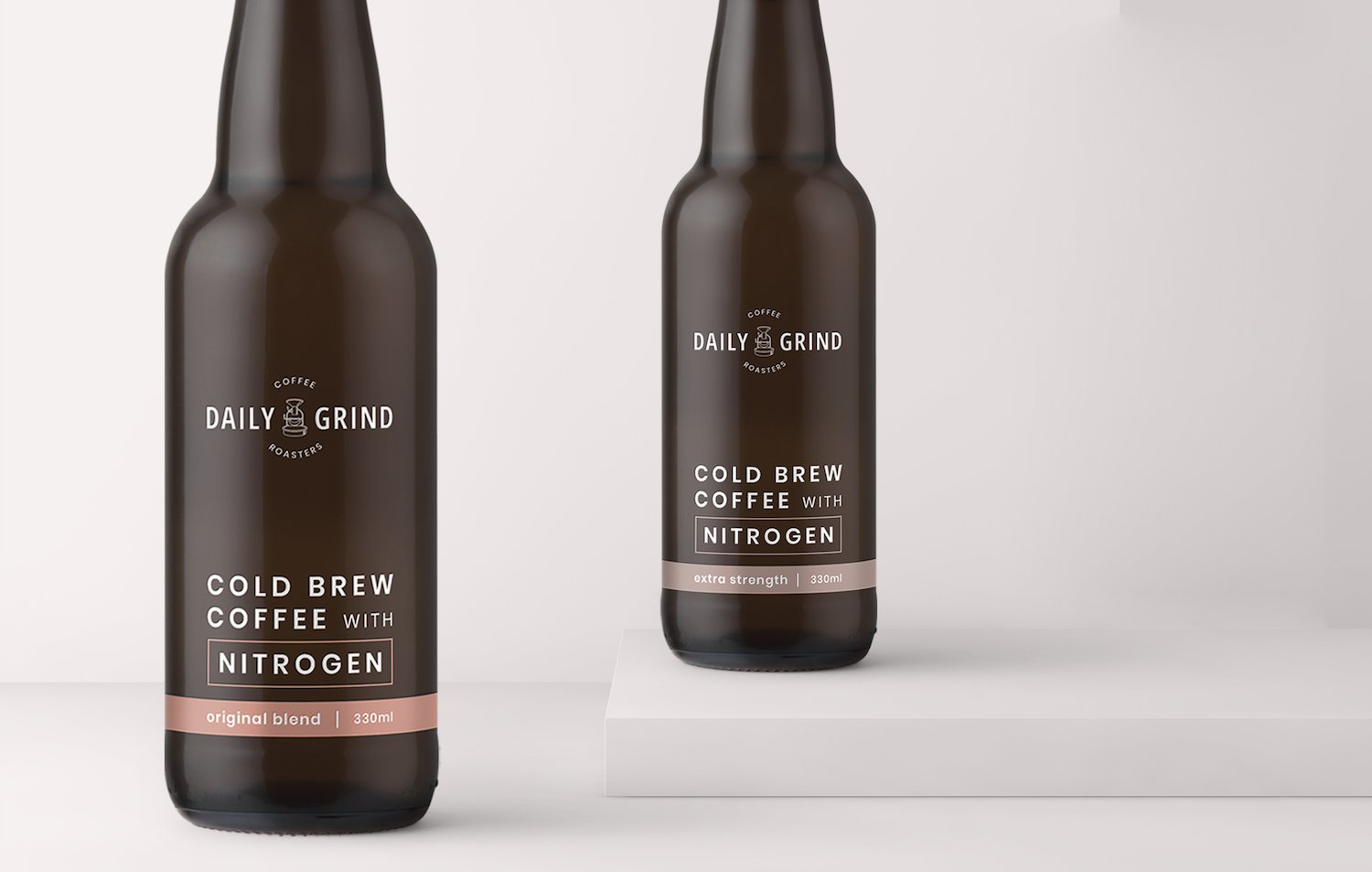
At Rooland, there’s one thing our office simply can’t function without: coffee. So when we had the chance to reinvent the brand identity design of coffee company Daily Grind — from branding, logo, and product labels — we were buzzing! (Or was that just from our morning cuppa?) We wanted to make this design clean and slick, but with our own added flair.
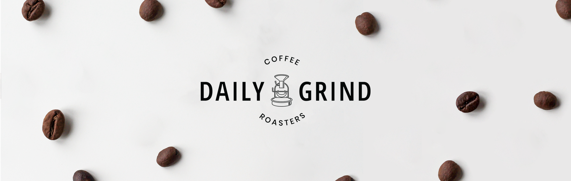
While we were creating new packaging for Daily Grind, we figured the original logo needed a refresh, too. Why not? Without starting from scratch, we took inspiration from the original logo and re-imagined the iconic image of the coffee grinder. We sketched our own neat line version of the image to keep the logo streamlined. We wanted to keep the typeface simple and modern. No mucking around.
We balanced the logo by placing the words evenly above, below, and on either side of our new coffee grinder icon. With just a few changes to typeface, placement, and an updated icon, we transformed the Daily Grind logo into a modern version of its former self.

As Daily Grind is based in Gerringong, we were itching to include an illustration of the iconic coastline and sweeping country hills of the NSW South Coast. We sketched up the area in a few different styles, including an old fashioned kind of etching. But in the end, the approach that best portrayed the rolling motion of the sea is the lino-cut style illustration that made it into the final product.
We chose to depict Werri beach: defined by the spiky shrubbery that lines the walkways and the ocean pool that’s cut out of the rock below the cliffs. Well known for its great surf, the waves take the main stage as they roll and crash all the way across the coastline. Not a bad spot to enjoy a brew.
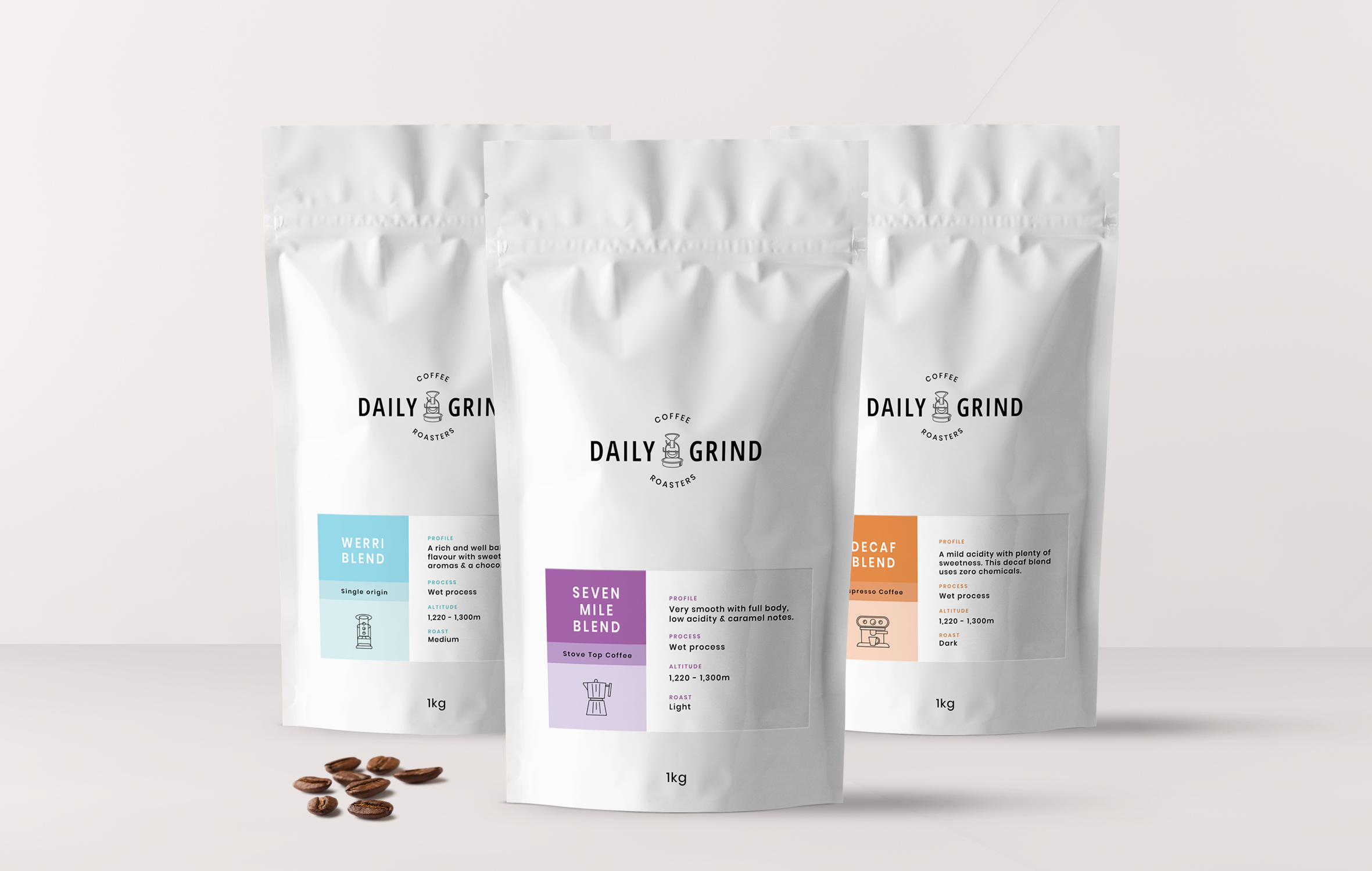
We wanted to keep the layout super sleek and minimal, with just the brand logo and blend label displayed on the front of the bag. As there are a few different blends available, all with their own unique tasting notes, we decided to colour-code each style, so coffee connoisseurs (such as ourselves) know they’re getting their favourite flavours.
We coupled this with a unique and simple line icon that easily establishes the best method for serving each blend, whether it be French press, percolator, or espresso.
We included our illustration of Werri Beach on the side folds of the coffee bags- to keep the front simple and sophisticated, but to make sure we got a touch of personality and fun in there too.
See more of our work for The Daily Grind here.