Is the Classic Blue Colour of 2020 Apt for Your Business Branding?
The year 2020 has a colour and it’s blue.
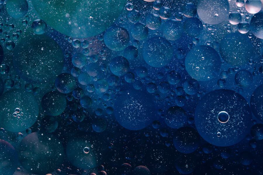
Paint company Pantone chooses the colour of the year every December. To mark the dawning of a new decade, the company has selected a shade that evokes a sense of peace and dependability: Classic Blue.
Also known as PANTONE 19-4052 in Pantone’s company parlance, the newly anointed colour of the year is a distinct choice from the rest of the blue hues the company has selected in the previous years (Cerulean Blue, Aqua Sky, Blue Turquoise, Blue Iris, and Serenity).
Pantone characterizes the Classic Blue colour as a “timeless and enduring hue” that draws its elegance from its simplicity. Pantone also describes the colour as a representation of stability in an uncertain time.
“Instilling calm, confidence, and connection, this enduring blue hue highlights our desire for a dependable and stable foundation on which to build as we cross the threshold into a new era,” Pantone stated in the colour profile that came with the announcement.
If you’re planning to redo your brand design this year using Classic Blue as the dominant shade, read on to learn more about the traits and psychology behind the colour.
Psychology Behind the Colour Blue: Traits and the Feelings it Evokes
In using the Classic Blue in developing your brand identity design, it’s essential to have an understanding of the traits, qualities, and the psychological meanings that the colour connotes. The basics of colour psychology in marketing tell us that colours play a powerful role in shaping moods and individual experiences.
You can often see blue in nature and it’s deeply seated in our psyches as a restful and sobering hue. We find blue as the shade of a vibrant daytime sky or the dark blue of the deep sea. It’s one of the main reasons why many people associate the colour with calmness and serenity.
Below are other associations people make with the colour blue which might prove useful in your branding decisions:
- Blue is the favourite colour for a lot of people and the top choice among men.
- It’s often considered a conservative and traditional shade.
- In addition to calmness and serenity, people also associate blue with feelings of peace, tranquillity, security, and order.
- Blue is commonly seen as a sign of reliability and stability. Businesses that want to project a trustworthy image use blue in their advertising and marketing materials.
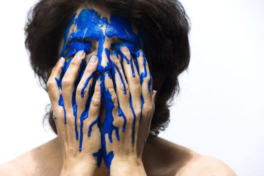
- This hue also stirs up feelings of aloofness and sadness.
- Many companies paint their office spaces with blue as research suggests that people work better in blue rooms.
- The colour blue helps lower pulse rate and body temperature.
- It may be a popular colour, but blue doesn’t do well in boosting people’s appetite. To be more effective, even weight loss plans recommend eating food off a blue plate.
Using Blue in Business
In general, blue works well as a brand colour for the corporate world. It’s commonly used for conservative types of businesses like accounting firms, banks, insurance companies, and other financial companies that need to establish trust and reliability in their branding.
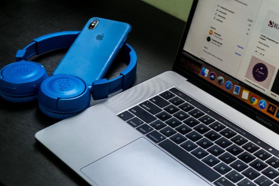
If you’re running a communication website and you’re aiming to appeal to individual customers, the Classic Blue shade may be useful in your marketing assets. Combined with a touch of grey, the colour can also suit your brand if you’re selling hi-tech and computer technology products.
Classic Blue is also recommended for businesses that offer cleaning products, mineral water or water purification, air conditioning, and other products and services associated with the sky, air, and water. Companies that promote technology, medical products, as well as male and female products should also consider using blue in their brand colours.
The colour should not be used for businesses that sell food products since blue isn’t a naturally occurring colour in food (except for blueberries). Sugar is an exception where blue/blue-pinks are used on the packaging as these colours are associated with sweetness.
Leave Your Design in the Hands of the Experts

Whether you’re revamping your brand identity or building it from scratch, you need the expertise of a professional brand designer. When you need a skilled hand to guide you in translating your story into a powerful brand identity the audience will love and remember, Rooland is here for you.
We provide a wide range of brand design services for Wollongong and Sydney clients, including brand identity design, logo design, packaging design, digital design, web design, and illustration design. Contact us today to get your project started!