Biolac
Challenge: Biolac, a trusted name in animal nutrition for over 50 years, wanted to refresh its brand presence. While their legacy was strong, their packaging wasn’t standing out in a competitive market. The challenge was to create a bolder identity that would grab attention on the shelf while honouring their years of expertise and commitment to animal welfare.
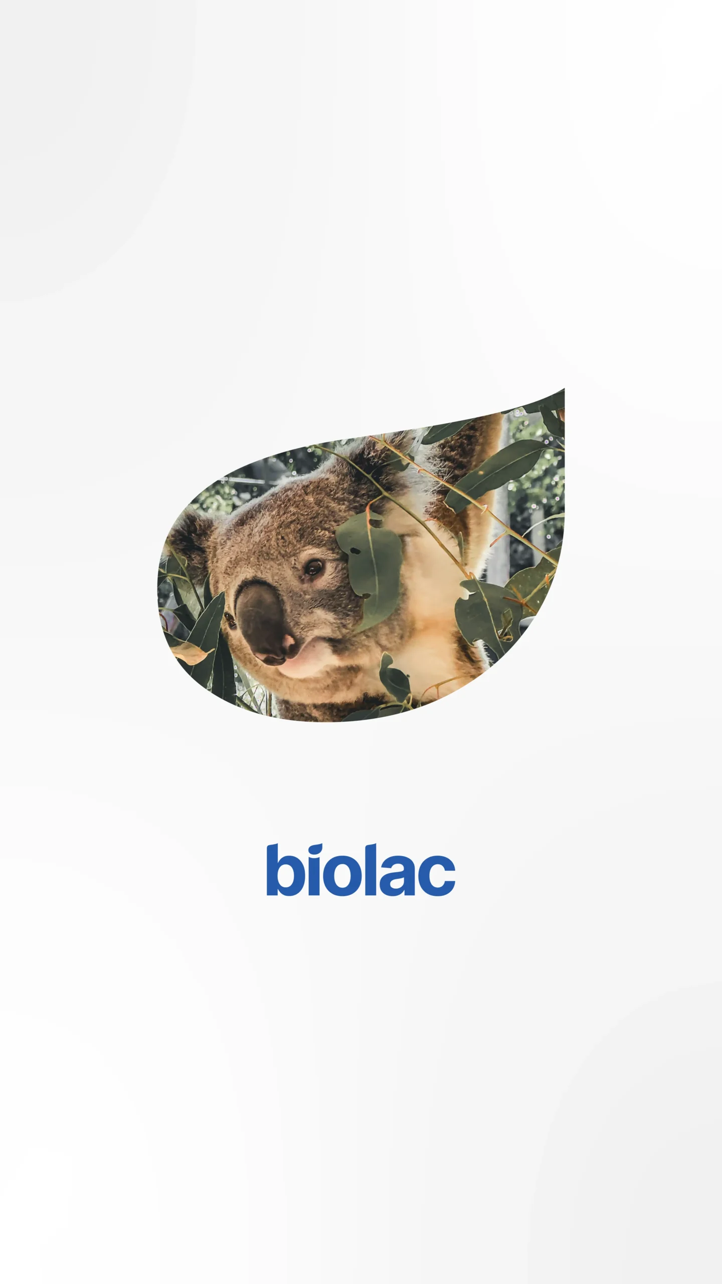
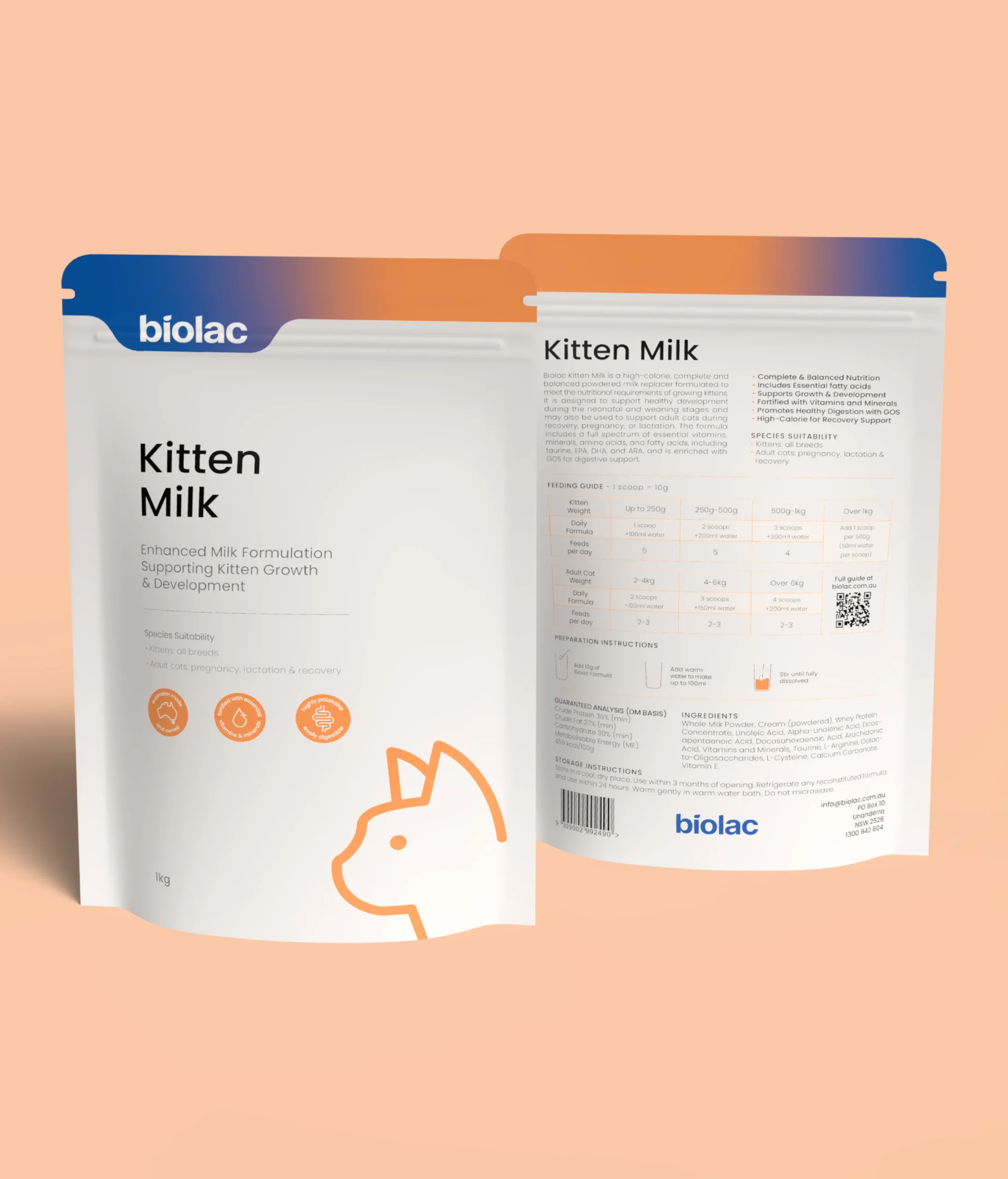
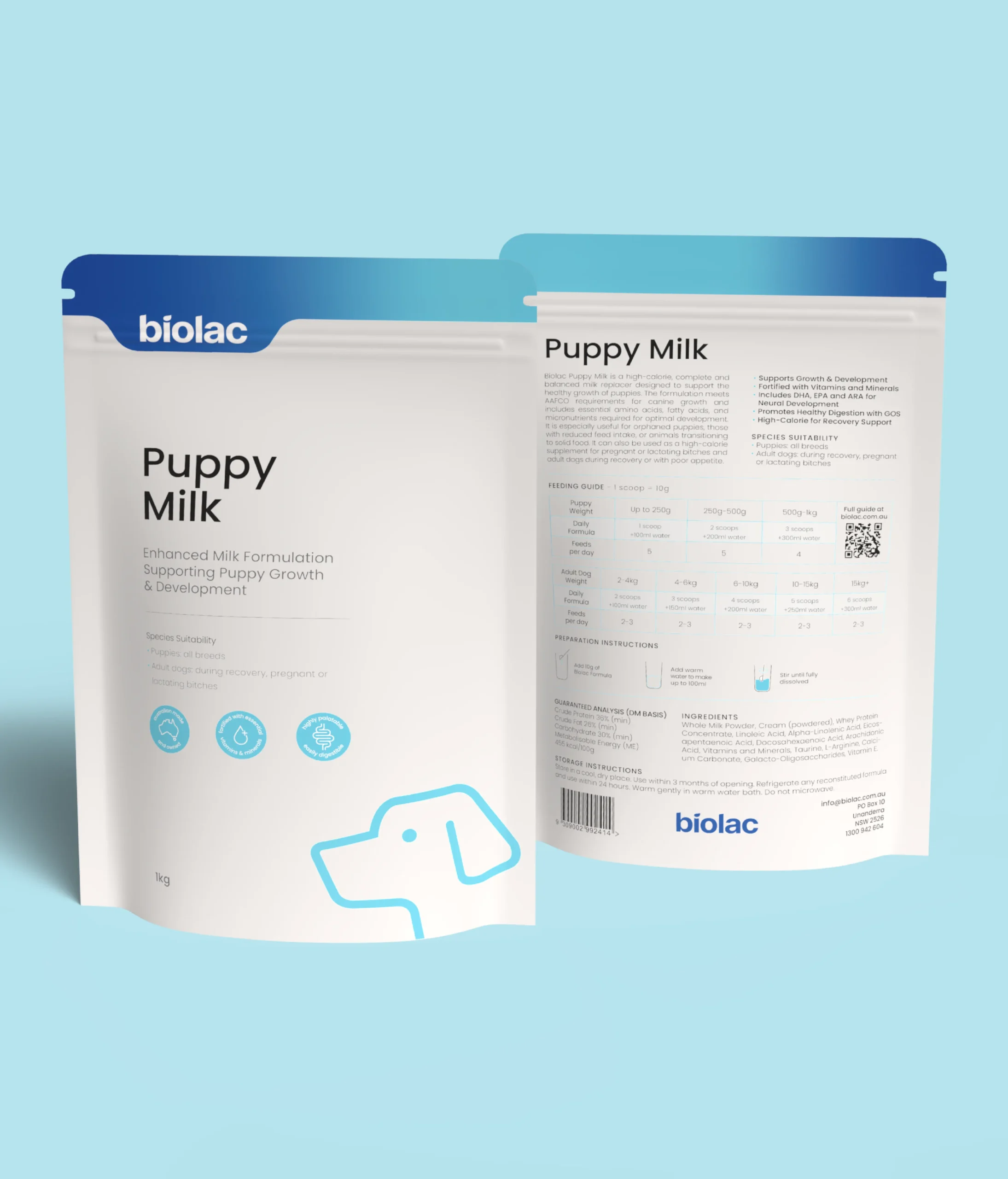
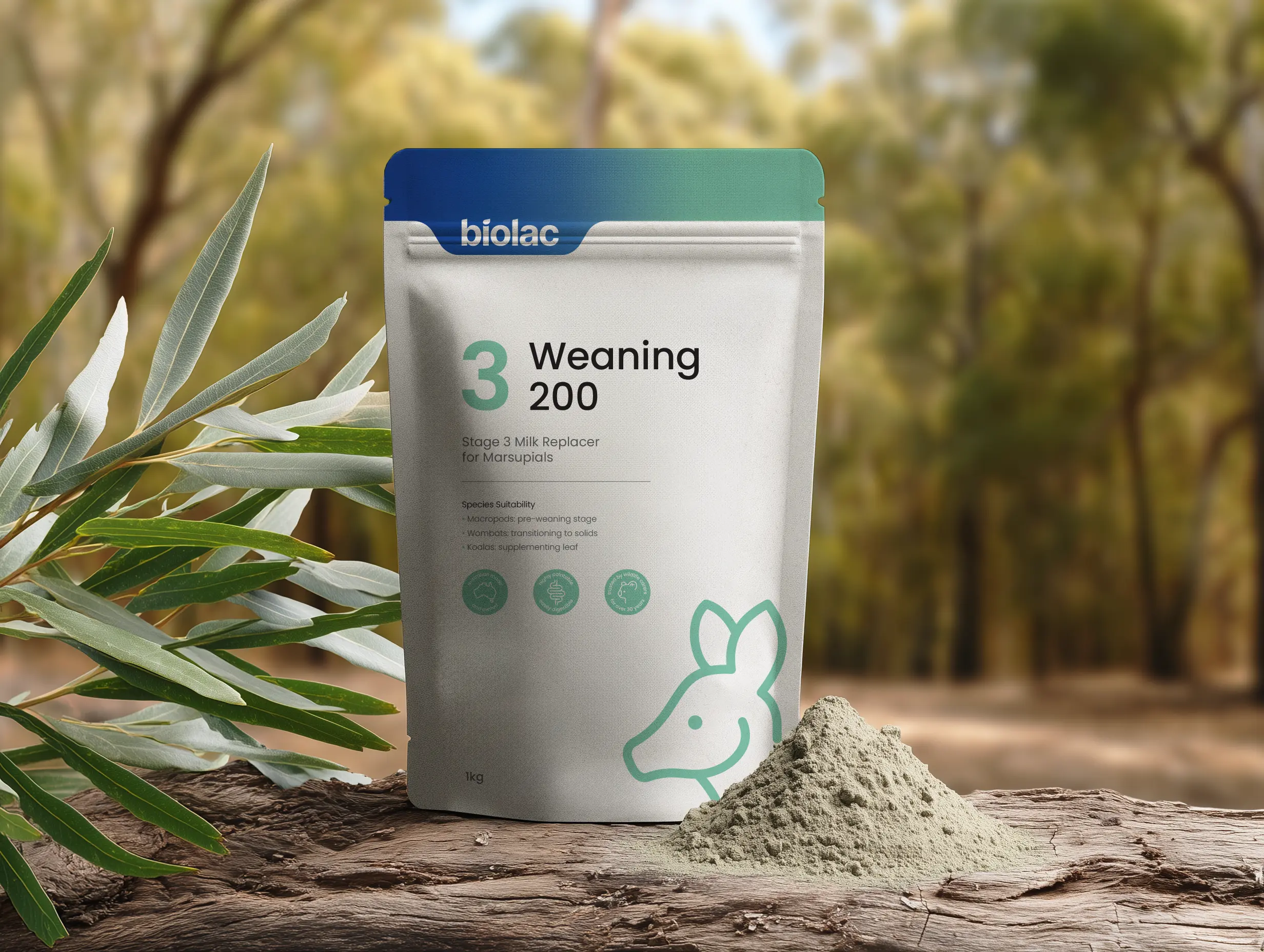
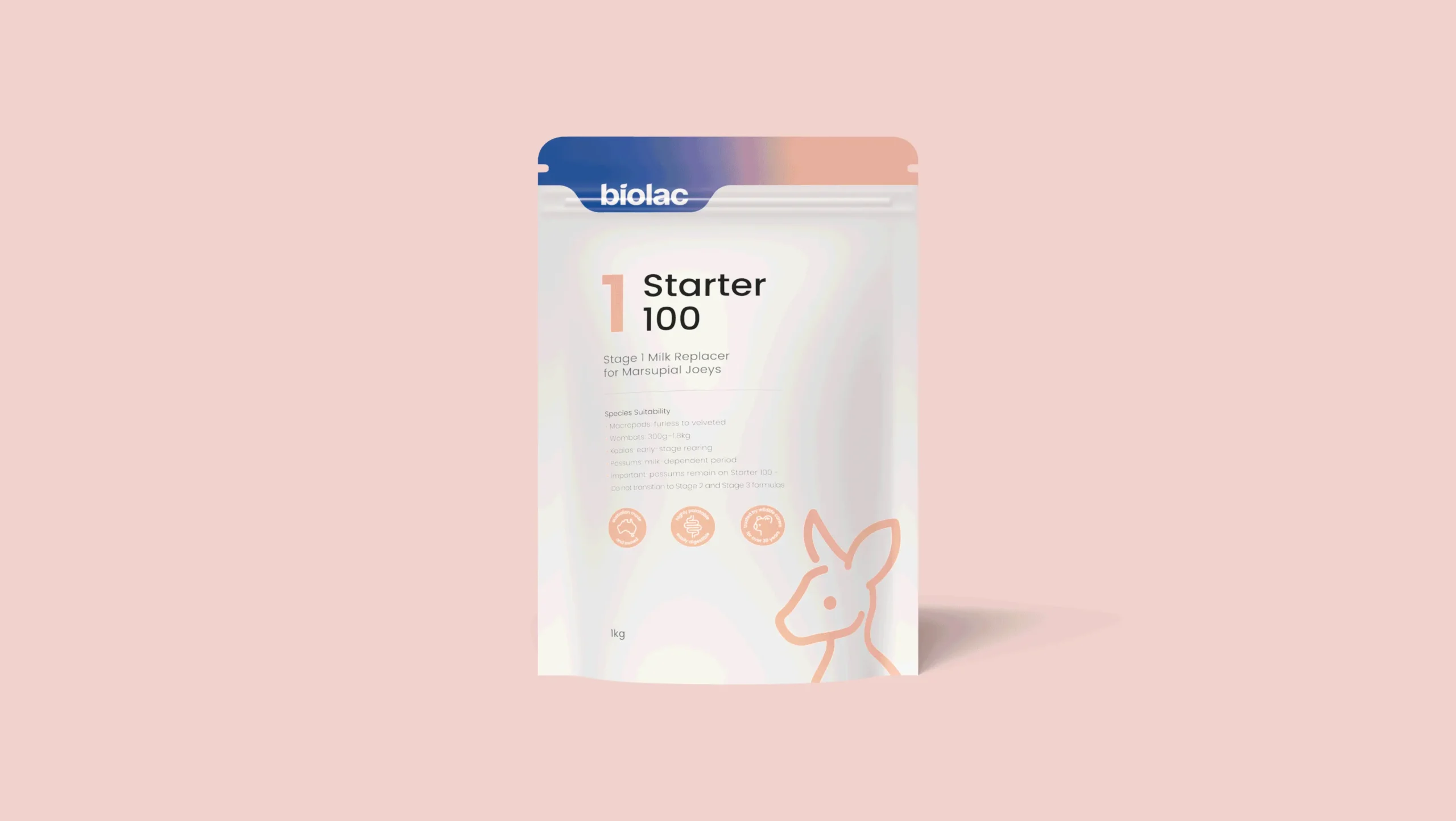
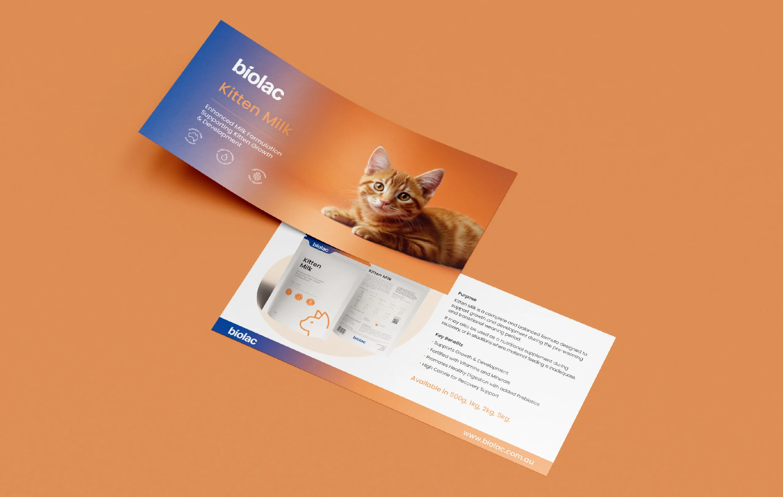
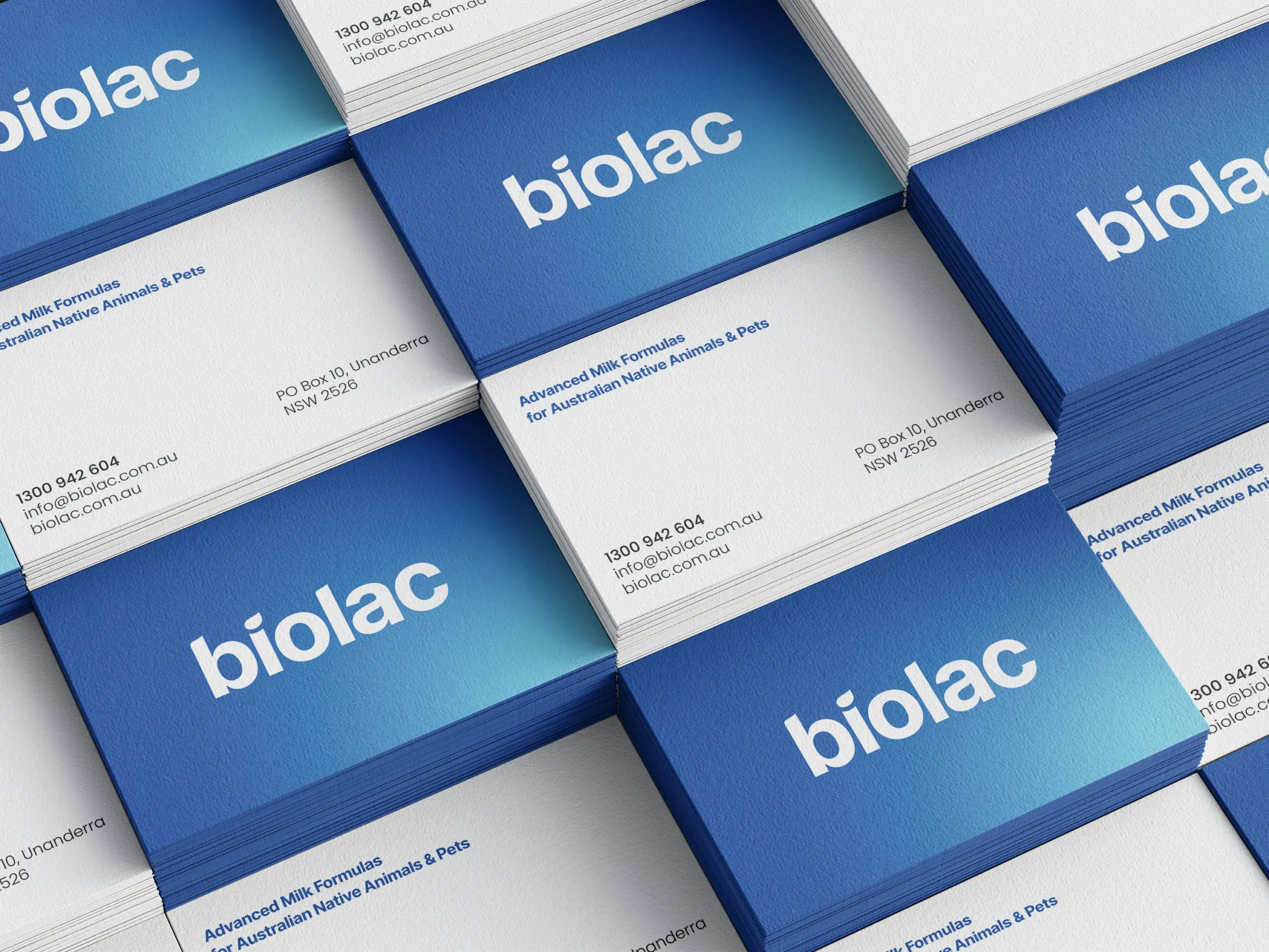
Solution: A Refined Logo: We made the Biolac logo bolder and more memorable. A key addition was a subtle drop, representing mother’s milk for young animals and communicating the brand’s purpose.
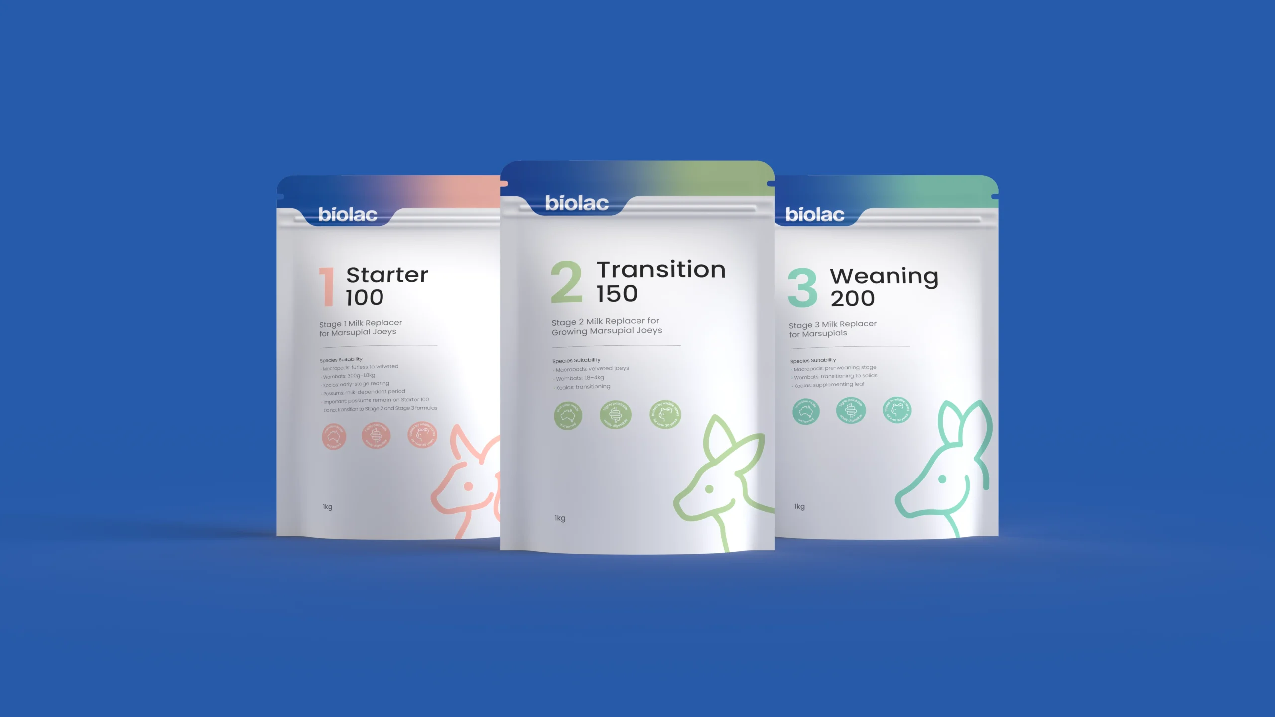
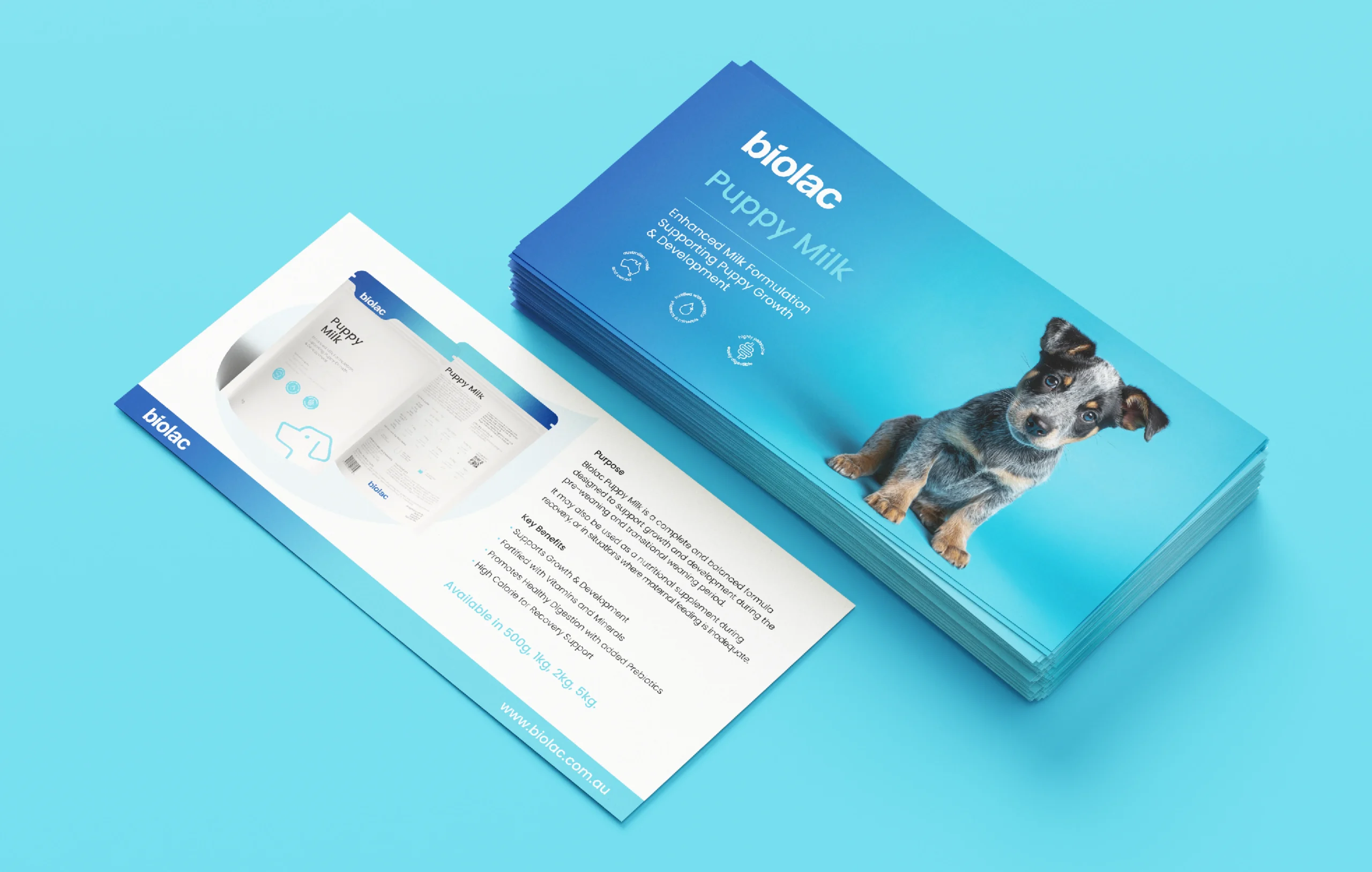
Purposeful Packaging: We proposed sustainable, compostable pouches for Biolac’s specialised formulas, ensuring eco-friendliness and ease of use with clear directions printed on each pouch. To enhance product selection, we designed nine distinct pouches, each tailored to a specific formula for animals like marsupials, kangaroos, and koalas. Custom illustrations of each animal were created, giving every pouch its own unique identity and character.
Storytelling: The back of each package was used to tell the Biolac story, highlighting their 50-year history of passion and innovation to build a deeper connection with customers.
Results: The new Biolac brand made an immediate impact. The packaging now commands attention, with unique illustrations and a bold design creating a strong shelf presence. The updated identity bridges Biolac’s rich history with its forward-thinking approach, resonating with both loyal and new customers.
LocationWAScopeBrandingYear2025